


Female Circus Platform | Branding
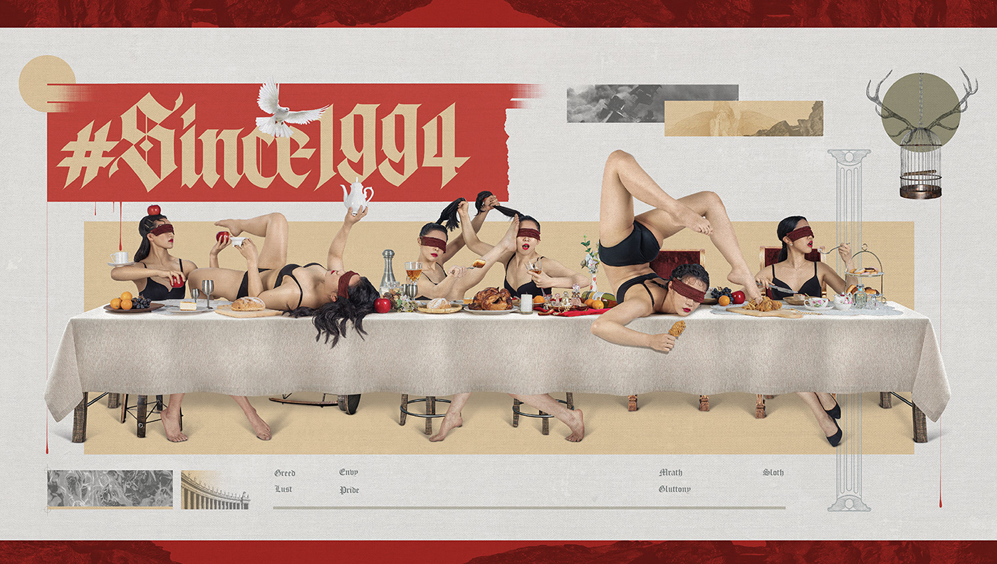
"Female Circus Platform (女子馬戲)” was created by the Eye Catching Circus team to cultivate and unite exceptional female circus performers, building on their work "Since1994". The design style, rooted in "Since1994", features a comprehensive approach. The typography balances structured Chinese characters and English Gothic letters, reflecting women's strength through sharp angles and ribbon-like strokes. This design echoes women's conflicts with societal frameworks, blending Eastern and Western typography influences. The Chinese character "女" (woman) logo icon maintains a logo icon distinctive identity across languages during global tours.


Credits
Client | 女子馬戲平台 Female Circus Platform
Production | 物以類聚視覺整合 Grandvity Design
Art Director | Noodle Wang
Account Manager | Grape Chiu
Executive Manager | Sarah Peng
Design Director | Si Jia Sun
Logotype Designer | Noodle Wang / Jasmine Lin
Digital Artist | Noodle Wang
Visual Designer | Jasmine Lin


